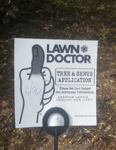
While out for a walk the other day, I passed a house with this sign in the yard:

This one might not even qualify as a linguistics mystery, since all the meaning is in the symbol of the hand/thumb and its color. Mostly this is a reminder to not use the black and white printer if your logo relies on color to convey meaning. What I'm getting from the black thumb (and the juxtaposition with the dead lawn) is that this company is the Doctor Kevorkian of lawns, which probably isn't what they are going for...
...unless this company is actually selling a modern-day way to cut back on water consumption by getting rid of your grass?! But a quick check of the Lawn Doctor website shows that no, the logo should have a green thumb after all.
